When Julie of Duet Letterpress realized her husband’s 30th birthday would fall at an inopportune time for a gathering, she came up with an ingenious s...
This week I thought I’d share my favorite typefaces of 2011, in no particular order. Just click on each image to pick up a copy for yourself....
I’ve recently become a fan of Jackie Besteman’s illustration work—especially her portraits and pattern design. There is quite a bit more to see in her...
I’ve mentioned before that Iceland is on my dream trip list. But since I unfortunately won’t be getting there any time soon, I’ll have to settle for l...
I was recently introduced to Jennifer Maravillas’s work via Fab.com, a newish flash sale site that offers tons of discounted designy products daily—it...
FOUND: 1. Saint George and the Dragon Laser cut Shadow Puppets, 2. J.Crew Vintage Matchstick Cords, 3. ban.do Sequin Scarf, 4. Mylar Confetti, 5. Chiy...
I’m loving these lush illustration pieces by Angela Rizza, an FIT graduate. Her goal is for the viewer to get a sense of nostalgia from her current wo...
Inflated/Deflated is a collaborative project by three Chicago-based creatives: Jillian Barthold, Lauren Connolly, and Kady Dennell, with photography b...
Feast your eyes on yet another gorgeous specimen of hand-embroidered typography by MaricorMaricar, featuring a quote from one of my favorite movies of...
The Lost & Found Department Etsy shop features a selection of awesome graphic prints—both letterpressed and screen printed—by Portland-based designer ...
I’m a firm believer that the best and most successful self-initialed projects grow out of a personal or shared passion. This is precisely the case wit...
For the past couple of years Atelier Martino&Jaña has done an excellent job creating the look and materials for the Guimarães Jazz festival, an annual...
Christina Hart is a recent grad of the Tyler School of Art graphic design program, who is now pursuing a career in illustration. I love her graphic, i...
Happy New Year Readers!!! I hope you had some time to relax and recharge over the holidays. We have lots of exciting things in store for 2012 and we c...
We’re signing off to celebrate Christmas and New Year’s with friends, family and a whole lot of relaxation. Happy Holidays and thanks for an amazing 2...
Take a look at Brandt Imhoff’s latest project, Twelve Fluid Ounces. The ongoing series of drawings is inspired by vintage beer cans. Love it....
Check out this super creative card by the folks over at Division Of/. Each year they aim to make a useful holiday gift, so this year they created a ge...
The Fruitful Field, by Maddison Graphic, is an identity and book for the Methodist Church introducing their project of the same name. I’m particularly...
It’s been awhile since I featured anything wedding-related, so I’ve been on the lookout. And as a huge fan of all things Hammerpress produces, this pr...
I’m very much in the mood for a holiday palette this week, and this vintage gem, from the stream of Alan Mays, sure is a beauty....
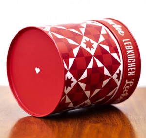
This beautiful Holiday “gift pack”, which includes 3 cards, gift tags, postcards and an ornament, was conceptualized, illustrated designed and printed...
As a team, Karen To and Piper Weaver developed the announcement and program for the CalArts 2011 Graduation. Based on theme of metamorphosis, the desi...
Check out the work of Paris-based illustrator an designer, Antoine Corbineau. His pieces feature an organized chaos of type, textures and illustration...
Air, by Positype, is definitely at the top of my wishlist. This workhorse super family features nine weights, regular, condensed and compressed styles...
These sophisticated stationery items by Loligo are perfect for someone who is looking for a somewhat traditional holiday card in a non-traditional col...
This stunningly beautiful invitation was designed by TOKY for the St. Louis Library Foundation’s annual gala. Here’s a little insight into the process...
FOUND: 1. Gingerbread Cookies, 2. Peppermint Crunch-Milk Chocolate Chip Cookies, 3. Eggnog Cheesecake Bars, 4. Peppermint Patty Brownie Bites, 5. Whit...
I’m always a fan of Erin Jang’s work, so it’s no surprise that I’m loving the new calendars designed for 2012. I have her 2011 Icon Calendar hanging u...
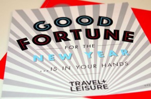
This playful fortune teller holiday card was created for Travel + Leisure magazine by art Director Jill Sabato and her talented in-house design team. ...
I’m consistently impressed with the work coming out of Atlanta-based Matchstic, so my eyes widened when I spotted the recent rebrand of their own stud...
I have been a fan of the Lost Type Co-op since it opened its doors. So I’m pleased to announce that as of this morning they have launched a brand new ...
This morning I’m loving the illustrative, hand-lettered designs of Quill and Fox, whose whimsical style adorns various paper goods in their shop. A sh...
I’m really excited about Gifted, a side project from the folks at Atelier 1A and FormFiftyFive. Gifted will be a mix of a “shop, blog and community fu...
I have a huge sweet tooth, so well-done branding for any dessert-related product is hard for me to resist. Case in point: Swoon, a custom sugar cookie...
Cast Iron Design Company, a relatively new two-man shop, has just launched their complete website. There’s lots of great work to be seen, but I was es...
Exciting news—two huge talents, Eric Strohl and Christine Celic Strohl have officially joined forces as STROHL, a San Francisco-based design firm spec...
This beautiful alphabet by Luci Everett was made out of the scraps from another project. I just rediscovered From Here to There: A Curious Collection ...
I’m loving the unusual characters in these colorful, woodcut-inspired illustrations by Berlin-based Jakob Hinrichs....
In addition to the illustrative details, I’m loving the color palette of this map created by Always With Honor for the MTV European Music Awards in Be...
Apologies if you saw this post disappear earlier today, an unfinished version of this post went up unintentionally. Like Figtree says in their descrip...
Abril is one of Type Together’s newest releases, a serif designed with intensive editorial use in mind. You can pick up the complete family of Abril D...
I’m loving the childlike, geometric illustration of the French artist Pepillo. Her work can be purchased in print form at L’Affiche Moderne, or in dig...
Check out the beautiful and intricate window painting by Barcelona-based Kikayis. ...
FOUND: 1. Edie Velvet Chaise, 2. Burgundy Plum Rectangular Post Earrings, 3. Fresh Sugar Plum Tinted Lip Treatment, 4. Garrett Leight Sunglasses, 5. L...
I loved Brad Woodard’s illustration style at first sight—especially this poster design he created for Big Fish, a submission to the current Silver Scr...
I’m loving this new screen print by Loulou & Tummie, Moonwalking the Dog—great color palette. Pick up a print for yourself in their shop....
Moxy Creative House presents Touristique, a series of five illustrated posters based on major cities. They’re available for purchase right here. New Y...
Back in May I posted about Project Neon, which at the time, was an active Kickstarter campaign. Well I’m excited to share that the accompanying Etsy s...
If you’re still on the hunt for this year’s holiday cards, this set by Sane and Able, The Londoner Christmas Games, is definitely a fun and one-of-a-k...
Take a look at this beautiful senior project by Tony Lee Jr., a recent graduate of Carnegie Mellon. He developed visual identities for three Puccini o...
Pantone reveals the color of the year: Tangerine Tango. “The Type Heritage Project [THP] discovers and documents the histories of digital display font...
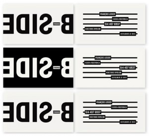
I’m loving the crisp black and white branding and materials for B Side Studios by Sébastien Bisson. via The Dsgn Blog...
This beautiful illustration was created by Javier Garcia’s 2011 Holiday Card. Such a lovely palette....
I can’t get enough of these hand-painted porcelain pins by illustrator Min Lee. A huge selection of them are available right here on Etsy. via Pikalan...
Andes is a new typeface from Latinotype. Designed by Daniel Hernández, the display face includes eight weights and is based on the design of Merced. Y...
Citizens for Optimism is a collaboration among 17 up and coming designers who strive to use their unique styles to inspire happiness through design. O...
Michael Croxton recently did a bit of work for Viacom and Viacom International that caught my eye. This first set of images represent a campaign creat...
FOUND: 1. Aspen Earrings, 2. Emerald Art Print, 3. Match Tealight Holder, 4. Block print Hello Poster, 5. Butter London British Racing Green, 6. Emera...
I first became aware of One Plus One’s work when I was really into wedding blogs during our wedding planning process. I immediately loved their weddin...
Hopscotch Design is the new studio of paper artist Chloe Fleury, who I featured back in February. She’s been quite busy since then, as you can see by ...