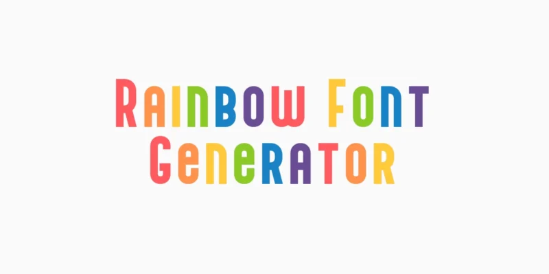
Transform your text into vibrant rainbow brilliance with our free Rainbow font generator! Perfect for creating colorful designs that bring joy and ene...
There’s something magical about that first crisp morning when you step outside and feel autumn in the air. The leaves haven’t quite turned yet, but yo...
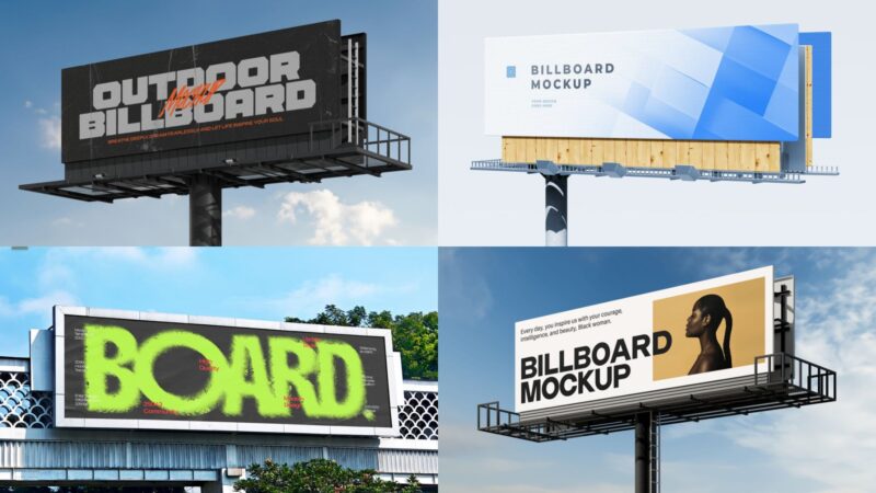
I’ll never forget the first time I really looked at a billboard. Not just glanced at it while driving—actually stopped and stared. It was massive. Lik...
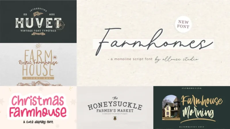
There’s something magical about walking into a perfectly styled farmhouse kitchen. You know the one—shiplap walls, vintage mason jars, and hand-letter...
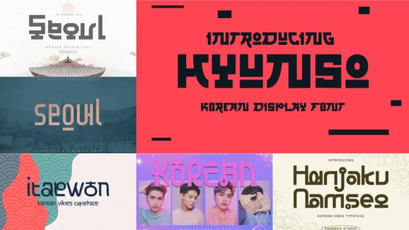
There’s something mesmerizing about watching Korean dramas with their beautifully designed title cards, or scrolling through Korean Instagram feeds wh...
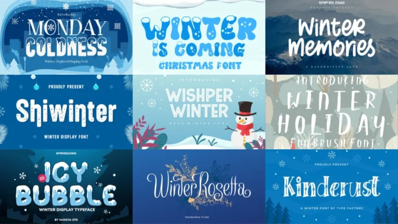
There’s something magical about the first snowfall of the season. That crisp air, the way light reflects off fresh powder, the cozy feeling of wrappin...
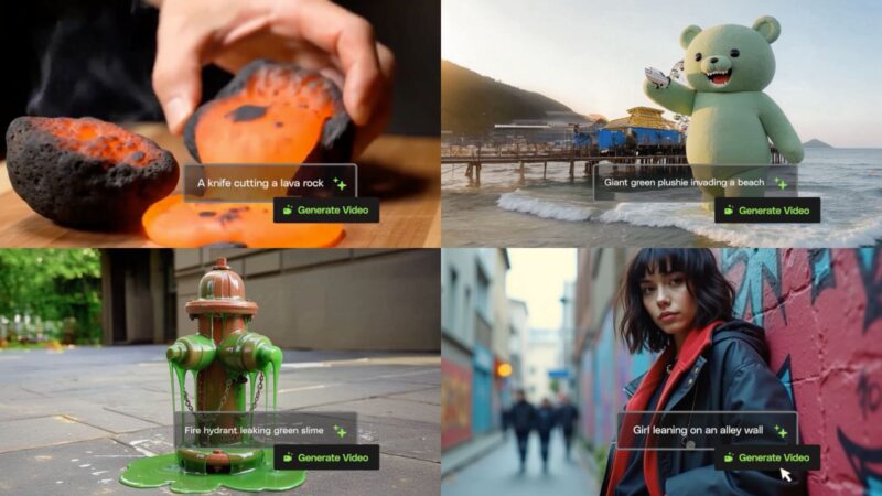
Creating video content used to mean blocking out entire days for filming, editing, and post-production. Now? You can turn a simple text prompt into a ...
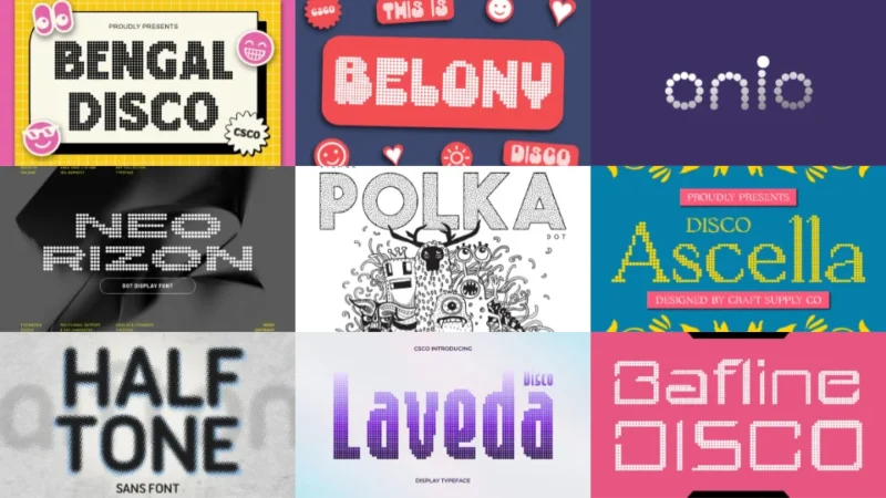
There’s something almost meditative about dot fonts. Each letter is carefully constructed from individual points, creating a texture that’s simultaneo...
There’s something undeniably elegant about opening a classic novel and seeing those crisp, timeless letters on the page. Or landing on a website that ...
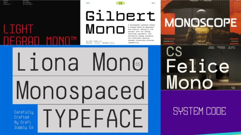
Monospaced fonts—meaning, typefaces in which all characters have the same width—aren’t just for developers anymore. These fixed-width typefaces have b...
Countless people have built their careers freelancing, and among the more popular professions are designers. People who haven’t been freelancing for t...
Look, I get it. You’re a graphic designer. You breathe Figma, live in Adobe Creative Suite, and can spot a kerning issue from across the room. But whe...
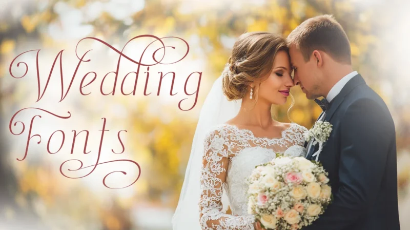
Choosing the right typeface for your wedding isn’t just about picking something pretty (though that certainly helps). It’s about setting the tone for ...
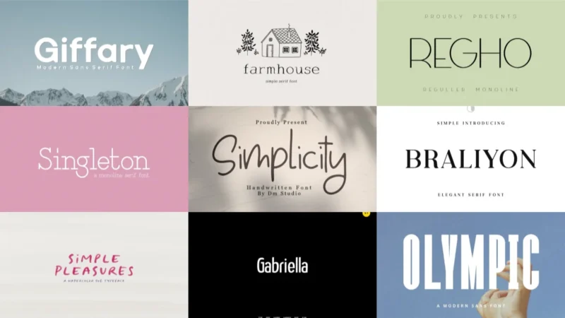
Sometimes the most powerful design choice is the simplest one. In a world drowning in decorative typefaces and elaborate scripts, simple fonts stand l...
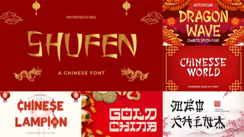
There’s something undeniably captivating about Chinese typography – the way each character tells a story, balances meaning with artistry, and connects...
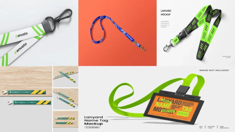
You’ve just finished designing what you think is the perfect lanyard for your client’s upcoming conference. The colors are spot-on, the logo placement...
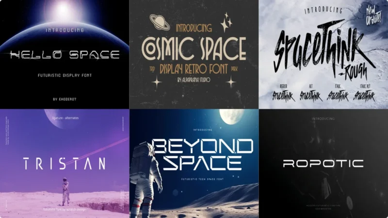
The cosmos has always captured our imagination, from the twinkling stars above to the mysterious depths of distant galaxies. And now, more than ever, ...
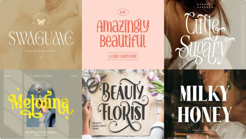
Beauty is in the eye of the beholder, but when it comes to typography, some fonts just have that undeniable “wow factor.” You know the ones – those ty...
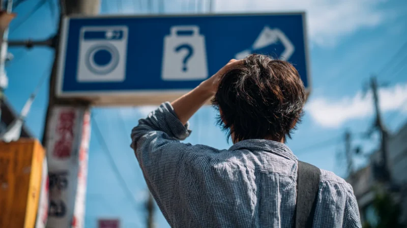
Design experts often highlight how a simple icon can be confusing when viewed through a different cultural lens. What feels intuitive in one country m...
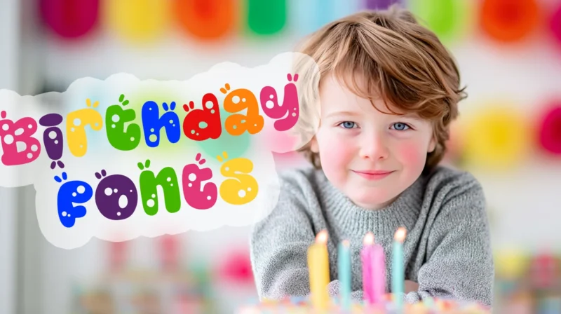
Picture this: you’re scrolling through your phone at 11:47 PM, suddenly remembering it’s your best friend’s birthday tomorrow. Panic sets in. You need...
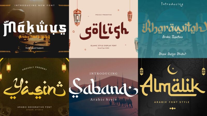
The flowing curves of Arabic calligraphy have mesmerized artists and designers for centuries. There’s something almost magical about the way Arabic le...

Scrolling is the new window shopping. If your catalog looks like homework, people are gone before the second swipe. And no, stiff PDFs stacked with pr...
For many professionals and brands, social media can serve as an excellent marketing tool. For visual designers and creative professionals, it can serv...
The size of the global remote collaboration tool market is expected to grow at a CAGR of 12.9% between 2026 and 2033. A significant part of this expan...
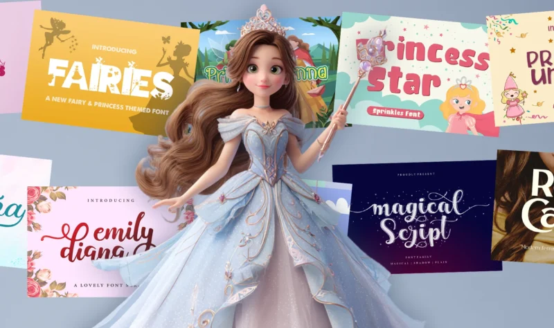
Every little girl (and let’s be honest, plenty of grown-ups too) has dreamed of living in a fairytale castle at some point. There’s something magical ...
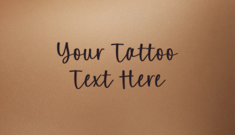
Transform your text into bold tattoo-style lettering with our free Tattoo font generator! Perfect for creating designs that capture the artistic tradi...
Picture this: you’re scrolling through Instagram and suddenly stop at a post that feels like it was etched by hand, weathered by time, and touched by ...
Picture this: You’re staring at a blank canvas on a crisp winter morning, and suddenly inspiration strikes like the first snowflake of the season. You...
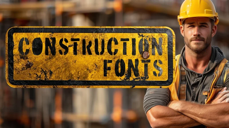
Hard hats, steel beams, and… typography? You bet! When it comes to construction and industrial design projects, the right font can be the difference b...
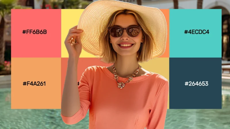
Coral’s magic lies in its perfect balance—vibrant yet sophisticated, warm yet refined. This versatile hue elevates everything from brand identities to...
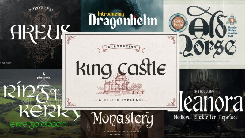
There’s something absolutely mystical about stumbling upon an old Celtic manuscript in a dusty library corner. Those intricate knots, flowing letterfo...
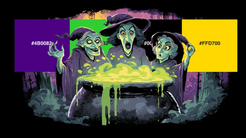
As a designer who absolutely lives for the spooky season, I can’t help but get excited when October rolls around and Halloween colors start making the...
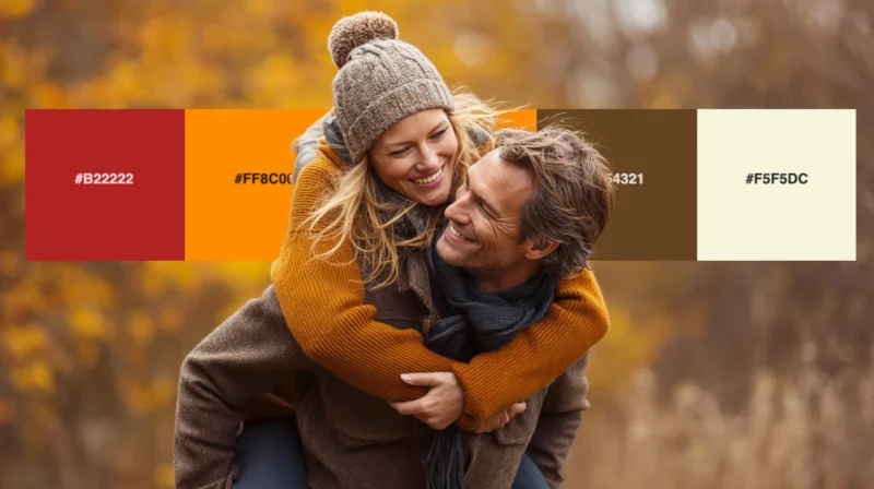
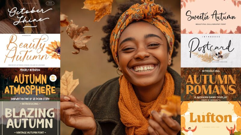
As the leaves begin to turn and the air grows crisp, I find myself completely captivated by the rich, warm hues that autumn brings. There’s something ...
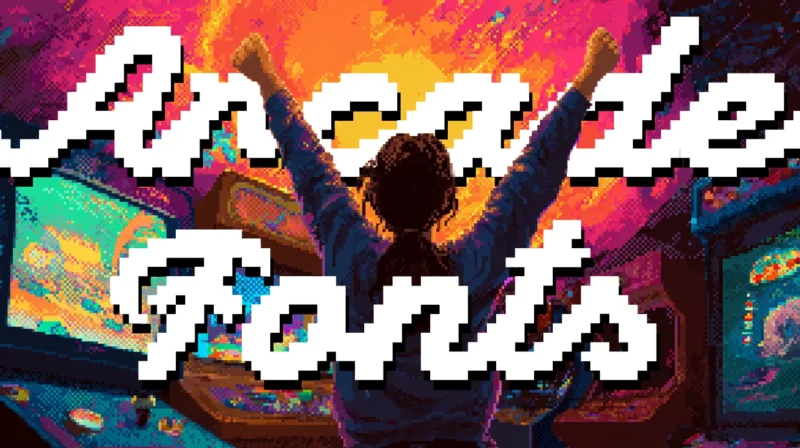
Remember arcades? They were magical. Your mom drops you off for the afternoon and suddenly you’re walking through a dimly lit arcade, surrounded by th...
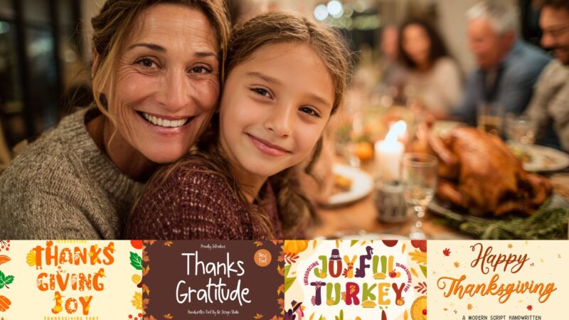
The leaves are turning, the air is crisp, and somewhere a turkey is nervously checking the calendar. Yes, Thanksgiving season is upon us! And while yo...
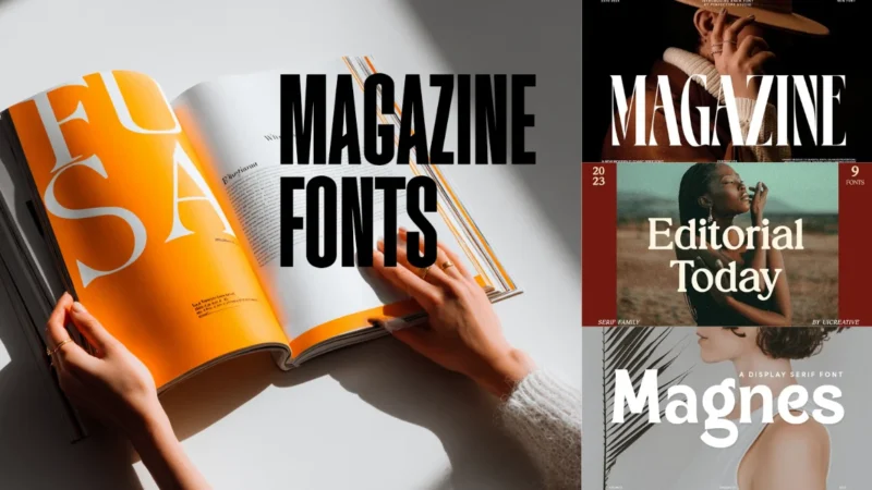
As a graphic designer who’s spent countless hours poring over magazine layouts, I can tell you that choosing the right magazine fonts is both an art a...

No matter what ‘Return to Office’ mandates might claim, you don’t need to come into the same building and use the same desk every day to do outstandin...
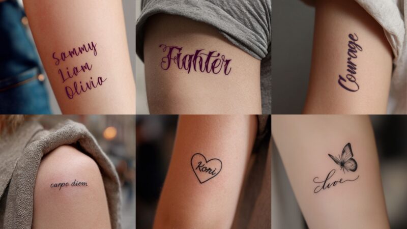
As someone who’s spent countless hours studying typography and working with tattoo artists, I can tell you that choosing the right cursive font for yo...
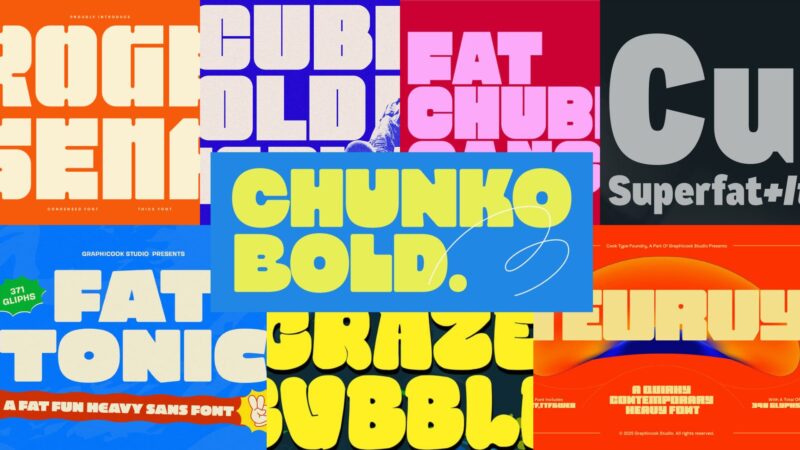
Thick fonts – also known as heavy, bold, or ultra-bold typefaces – are characterized by their substantial stroke weight and commanding presence. They’...
Times New Roman – timeless, dependable, and probably sitting on every computer right now. But what if you’re craving something with that same classic ...
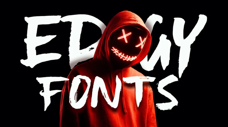
Edgy fonts are the rebels of the typography world. They’re bold, unconventional, and often incorporate elements like sharp angles, distressed textures...
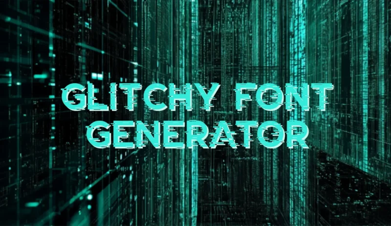
Transform your text into digital chaos with our free Glitchy font generator! Perfect for creating corrupted, cyberpunk-inspired designs that look like...
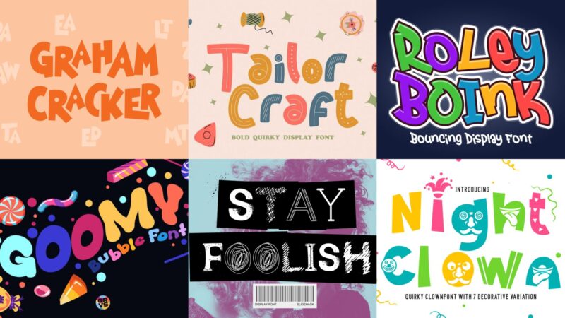
As graphic designers, we often find ourselves stuck in the serious world of corporate sans-serifs and elegant scripts. But sometimes, a project calls ...
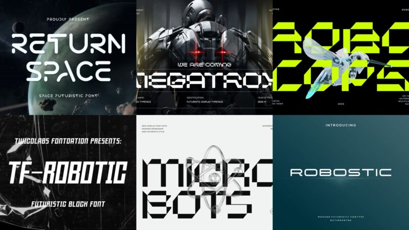
I can’t help but get excited about robot fonts. There’s something absolutely captivating about the way these futuristic typefaces can instantly transp...
Video content has completely taken over the digital landscape. Whether you’re scrolling through TikTok, catching up on Instagram Stories, or watching ...
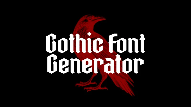
Transform your text into darkly elegant beauty with our free Gothic font generator! Perfect for creating mysterious designs that capture the haunting ...

Designing has always been about finding that one choice that drastically changes how someone experiences your work. Sometimes, that may have to do wit...
You’re about to drop serious cash on your online presence, but here’s the thing – most people can’t tell the difference between a domain and a website...
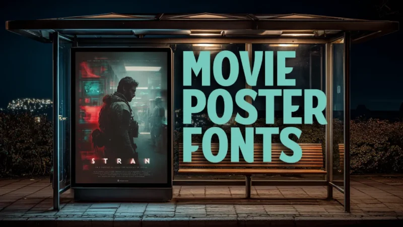
As a graphic designer and film enthusiast, I’ve spent countless hours studying the typography that graces cinema’s most iconic posters. There’s someth...
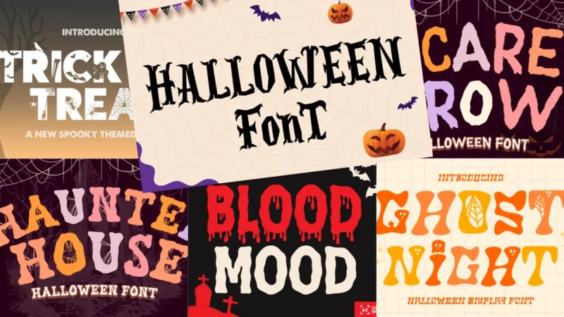
There’s nothing quite like the perfect Halloween font to transform an ordinary design into something absolutely bone-chilling. Whether you’re crafting...
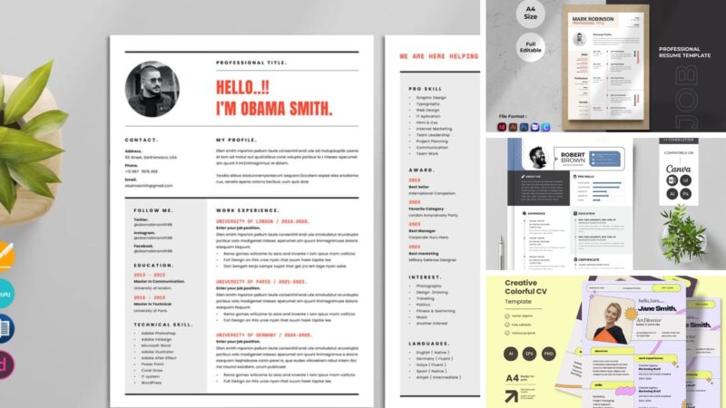
Gone are the days when you needed to be a graphic design wizard to create a stunning resume. Canva has democratized professional resume design, offeri...
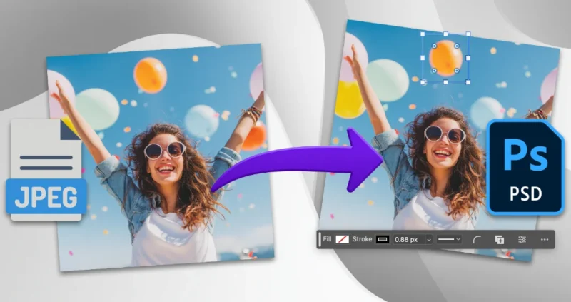
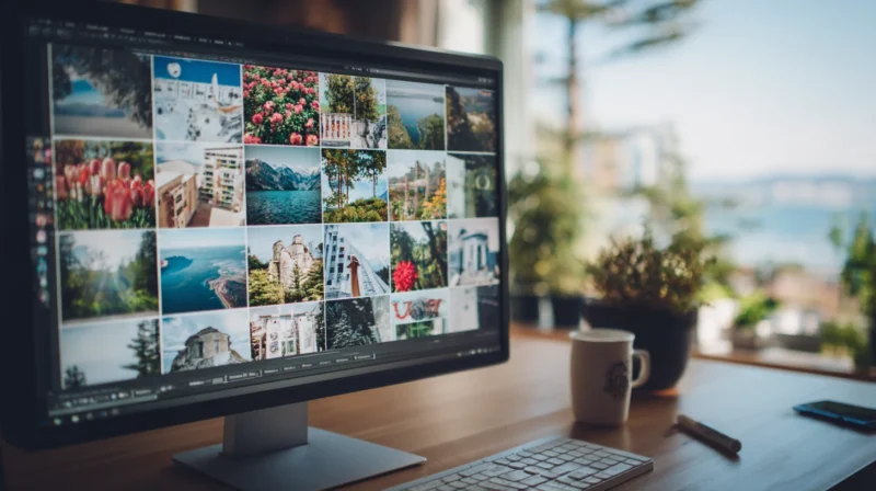
Converting JPG images to PSD format opens up a world of professional editing possibilities that simply aren’t available with standard image formats. W...
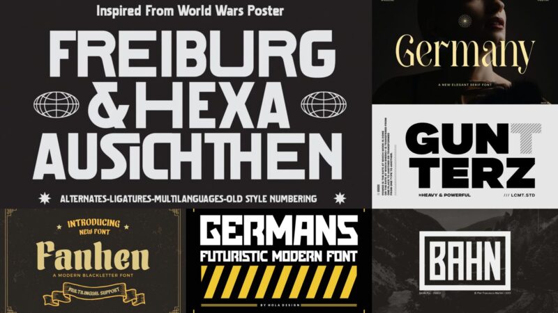
I’ve always been fascinated by the rich history and distinctive character of German fonts. There’s something absolutely captivating about the way Germ...
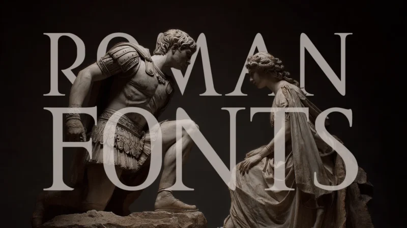
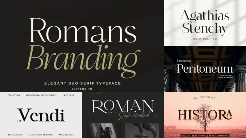
As graphic designers, we’re constantly seeking typefaces that can transport our audiences to different eras and evoke specific emotions. And in , Roma...
Transform your text into legendary meme format with our free Impact font generator! Perfect for creating classic internet memes that would make Succes...
Transform your text into classic professional elegance with our free Times New Roman font generator! Perfect for creating timeless designs that never ...
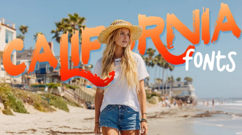
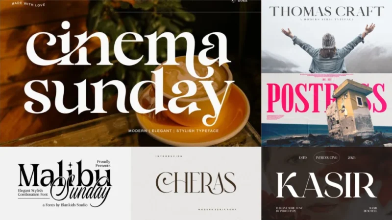
The Pacific breeze carries more than just salt air – it brings with it a design sensibility that’s been shaping visual culture for decades. California...
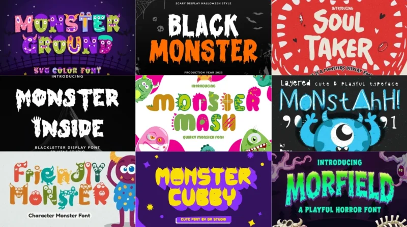
The shadows are lengthening, and somewhere in the depths of your font library, something sinister is stirring. Monster fonts have crawled out from the...
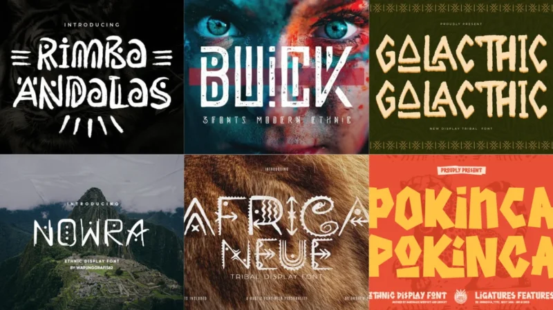
The design world is witnessing a fascinating shift as more creators embrace fonts that carry ancient wisdom and primal energy. Tribal fonts have emerg...
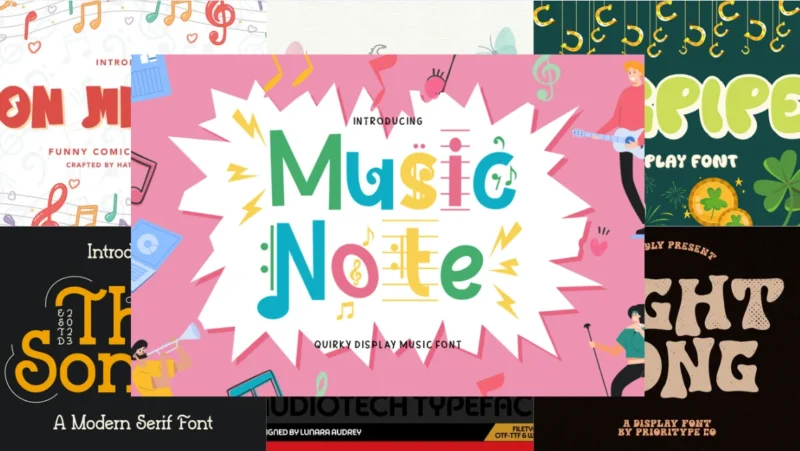
From vinyl records spinning in dusty shops to streaming playlists lighting up our screens, one thing has remained constant in music design: typography...