I’ve always been a fan of Nicholas Felton‘s personal annual reports—so much so that I own every single one, in all of their data-heavy, infographic, p...
Regular readers may remember the introduction of the Slate Mobile Air Desk seen here a few months ago. At that time my enthusiasm for this new product...
Alliteration Inspiration is a weekly column featuring the top twenty pieces of visual inspiration based on two random alliterative themes. This week’s...
This week’s Wise Words come from Antoine de Saint-Exupery via this great collection of leadership quotes, by way of Swissmiss....
At the moment, I happen to be anxiously anticipating Wes Anderson‘s new film, The Grand Budapest Hotel (now in select theaters.) So when I spotted Nat...

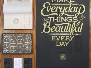
It’s hard to believe Liz Danzico has as many hours in the day as the rest of us. She’s the founding chairperson of the MFA in Interaction Design Progr...
Lovely clean, modern, sophisticated work for BNT Studio, “a distribution studio devoted to design and innovation,” by Emmanuel Cohen....
Malina is a new display face by Katatrad, a Thailand-based foundry. Defined by graceful, elegant letterforms, the typeface includes four fonts—two wei...
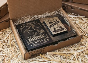
The team at MM Identity Lab just finished a fantastic self promotion project, working with local vendors to create their Year of the Horse Card Deck C...
Graham and I were having a bit of a dialogue over the weekend about what hot apps were going to come out of SXSW this year. He’s there on the ground, ...
Congrats, Allison—you’ve won a free pass to the upcoming RE:DESIGN UXD Conference! Please shoot me an email so that I can pass your contact info onto ...
San Francisco just got even more eye-popping with MINE‘s branding and environment design for Bun Mee’s new Market Street location. From the large, bea...
Texas two-man operation Deuxtone executed some exquisite work in designing the brand identity and environment for Dichotomy Coffee & Spirits in Waco. ...
Username: gopro Name: gopro Info: We make the World’s Most Versatile Camera. Wear it. Mount it. Love it. Everyone has heard of GoPro, right? The tiny,...
As a personal project, designers Naomie Ross and Daniel Renda set out to rebrand Pastosa Ravioli Co., an NYC shop whose pasta they both grew up eating...
When Adobe came to them to create an interpretive graphic of their logo, Sagmeister & Walsh came up with the brilliant idea of turning the process int...
This Perth, Australia-based Etsy Shop, Vintage Posters Art, is offering some awesome vintage poster reproductions. Their stock mostly covers travel—th...
I’m loving this vibrant work by 1983 Present for The Happy 8, a chain of hotels in Malaysia. The Happy 8 is a high-quality chain hotels brand of Malay...
Alliteration Inspiration is a weekly column featuring the top twenty pieces of visual inspiration based on two random alliterative themes. This week’s...
It’s that time of year again! The 2014 RE:Design UXD Conference is coming up at the end of April in Brooklyn, and I’m happy to offer one lucky winner ...
Wise Words about the good things that can come from sharing your work from Tim O’Reilly via Austin Kleon...
It’s been far too long since I’ve posted a project from the ladies at Stitch Design Co., so this morning I’m excited to share their latest packaging p...
New Zealand is known for its extreme natural beauty (see Peter Jackson’s Tolkein movies for reference), and its design scene is pretty great, too. Thi...
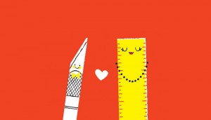
Over the years, Typejockeys has come up with various ideas for fonts that don’t necessarily warrant a huge, in-depth typeface buildout. So to give the...
Today, Scotty Reifsnyder and Chronicle Books release Cheers!, a set of 12 notecards and envelopes “perfect for toasting any occasion.” The set include...
A recent study from TiVo says that 76% of television viewers prefer to just watch what is on the TV rather than be distracted by the multitude of mult...
I’m blown away by the interior design work of Jean de Lessard in Montreal, Quebec. The environments that Jean and his firm have created for local busi...
Between the kaleidoscopic use of color and deconstructed, abstract forms, I can’t stop staring at Rollercoaster, a new illustration series by Atelier ...
Username: perrycolante Name: Andrew Zonzini Info: illustrator / graphic designer. All photo’s made by me. If you’re looking for an Instagram account w...
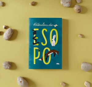
The book cover designs of Isabel Urbina for Random House, New York are absolutely delightful examples of lettering, textures and illustrations combine...
While browsing Klim Type Foundry’s blog recently, I discovered D.T. Practice’s work for UK’s The Roxy. Featured because of its heavy use of a modified...
I’m excited to share more new beautiful work from Studio MPLS, this time a new brand identity, stationery and packaging project for Alli Marie, a new ...
Did anyone not fall in love with Mayhem this week? If you’re not familiar, Mayhem is an adorable, ultra creative four-year-old who makes dresses out o...
Luvocracy Love is a monthly column that features a handful of the products I’ve spotted over the past four weeks. Shop the links: 1. Colour + Pattern ...
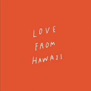
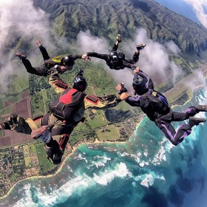
One of the many reasons I fell in love with Hawaii when I first visited a few years ago, was the Aloha spirit that is in the air. Beyond a greeting, a...
Alliteration Inspiration is a weekly column featuring the top twenty pieces of visual inspiration based on two random alliterative themes. This week’s...
Wise words from David Ogilvy, the “Father of Advertising.” For more wisdom, also check out his 10 Tips on Writing on Brain Pickings...
It’s so encouraging to see good design making its way into schools, and I’m absolutely enamored with Cherry Bomb Design Studio‘s illustrations in the ...
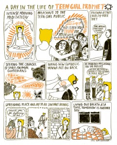
As of late, comics are enjoying greater popularity—and respect from the art world. One of the best side effects of this trend is a wider variety of pe...
With as much negativity that exists within and toward the world of hip hop, the genre’s positive influences can be easy to overlook. With this in mind...
Revisal is a new typeface from Switzerland-based foundry Type Dynamic. This “humanist sans family” includes seven weights plus italics, from hairline ...
Personally, I’m not a huge fan of coconut water as a beverage. But despite that face, I am loving the fresh, sunny packaging that Marx Design recently...
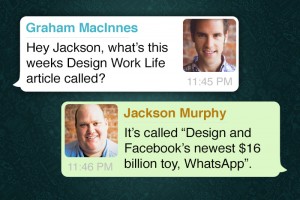
Last week Facebook bought popular messaging company WhatsApp for $16 billion (Yes with a b), giving the social media company yet another crown jewel i...
The folks at Bolster have executed some fantastic work for Blue Plate Restaurant Company in developing the brand identity and overall brewpub experien...
As an avid user (and teacher) of Skillshare’s online classes, I thought it would be great to use this column to highlight a few of their offerings eac...
Audiophiles and collectors alike argue that there’s nothing like holding and owning a real life, tangible vinyl record as the world continues to becom...
Username: zacharysmithh Name: Zachary Smith Info: Do what you love | @knowwhereco There are plenty of artists, designers and typographers sharing thei...
I am loving the work that Minneapolis’s Little has developed for Fair State Brewing Cooperative, Minnesota’s first cooperative brewery. As a co-op, th...
I’m really enjoying the work of Justyna Medoń, head of Red Poppy design studio in Warsaw, Poland, who specializes in hand screen printed textiles and ...
Matt Stevens‘s Junk Drawer series is an ongoing set of illustrations that depict “fascinating characters from pop culture by showing the random and fo...
I’m loving these cool “Seeing New York” Cinemagraphs by Ann Street Studio found via Diego Guevara’s blog. The folks at Global Inheritance are looking ...
Alliteration Inspiration is a weekly column featuring the top twenty pieces of visual inspiration based on two random alliterative themes. This week’s...
Sarah Abbott’s Etsy Shop features a collection of prints and paper goods designed by the Sheffield, UK based artist, who clearly has a strong affinity...
I was happy to recently discover the work of Los Angeles-based Chris Turnham, who has worked as an artist in both feature and television animation and...
This week’s wise words come from Justin McMurray’s Medium article, The time is now to share your work with the world. Found via Austin Kleon‘s blog Th...
You may remember seeing Jessica Hische‘s epic wedding website awhile back, a richly detailed parallax design featuring the work of many of her and now...
Illustrator/designer Kitkat Pecson just launched her new portfolio site a few days ago. If you’re looking to revamp your website—or build a new one as...
Just as it was with print, editorial design on the web is always an exciting playground for designers. And today pretty much everyone is in the editor...
Nomada, a new release from Tipografies, is a compact set of sans serif fonts in four upright weights, from light to black. Pick up a copy for yourself...
Philadelphia-based designer David P. L. Jones recently finished some brilliant new work on Alibi Spirits, spanning both spirits packaging and book des...