A design case study is a detailed description of the process of working on a product, from setting tasks to the result obtained. It helps clients and ...

In the world of User Experience (UX), every detail counts. Color is one of the most powerful tools designers can leverage. Color serves a variety of i...
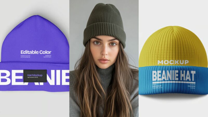
Beanie mockups have become an essential tool for creating compelling presentations that truly “wow” clients. Beanie mockups allow you to visualize you...
![Amalfi Coast Font [DOWNLOAD] & How to Use](https://designworklife.com/wp-content/uploads/2025/03/Amalfi-Coast-Font-Image-00001-800x533.jpg)
There’s something undeniably captivating about a beautifully-crafted script font that just seems to flow across the page with ease and elegance. In th...
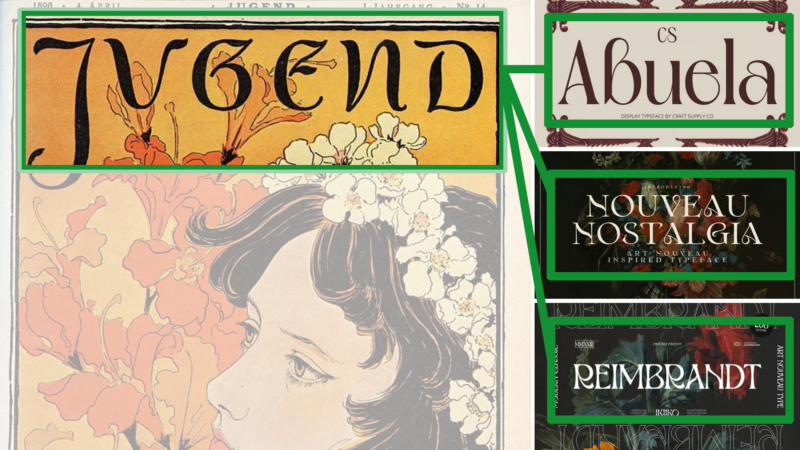
There’s something magical about the way Art Nouveau fonts capture the spirit of an era that celebrated organic beauty and artistic craftsmanship. Art ...
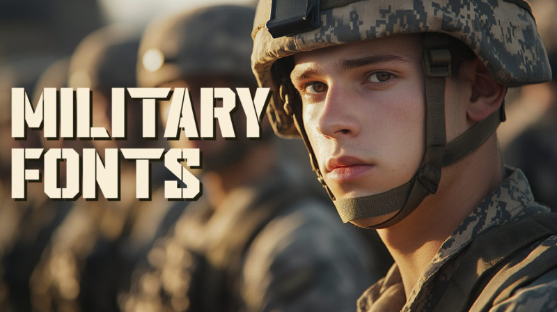
Military fonts bring that perfect combination of strength and readability that can transform ordinary designs into commanding visual statements. Milit...
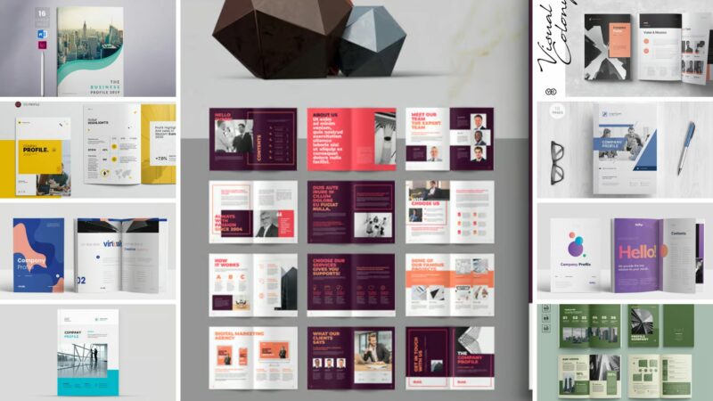
Creating a company profile is one of those tasks that seems simple at first glance but quickly becomes overwhelming. You need to present your business...
Not so long ago, disciplines such as photography, design, and illustration relied solely on tools like cameras, Photoshop, or Illustrator to produce v...
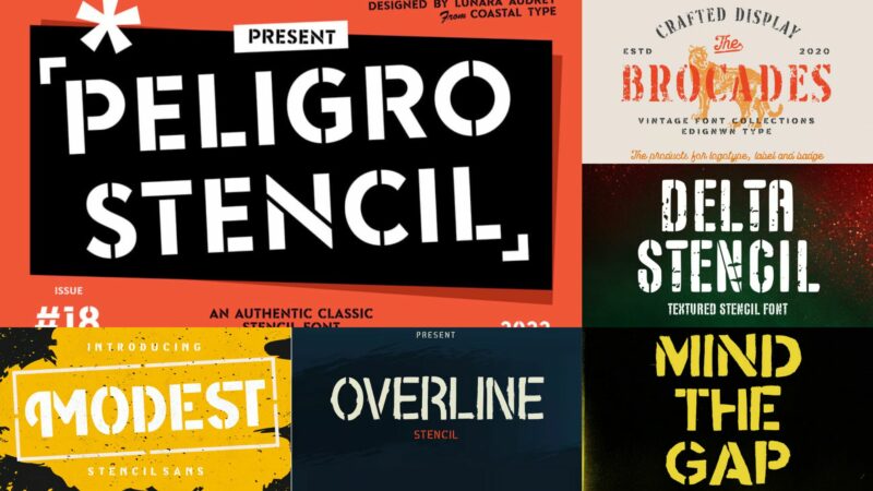
As designers, we’re constantly seeking typefaces that make our work stand out from the crowd. And when it comes to creating designs with industrial st...
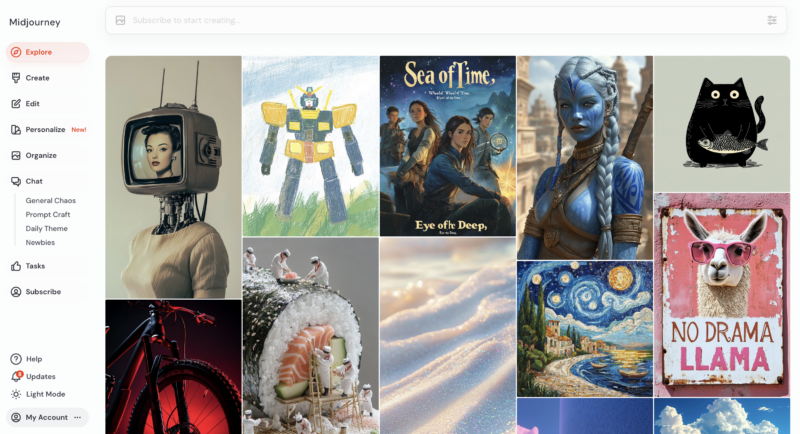
As AI-generated art continues to evolve, pushing the boundaries of creativity and technology, artists worldwide are using AI tools to craft visually s...

Huge digital asset collections are now available to graphic designers who need stock photographs alongside vector graphics together with fonts and tem...
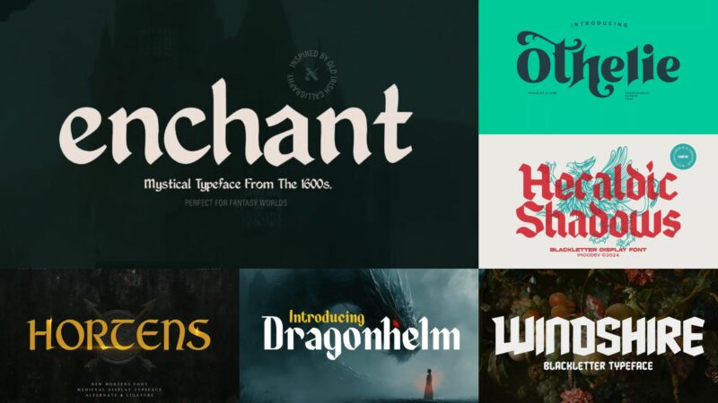
As designers, we’re constantly seeking fonts that transport viewers to different eras and evoke specific moods. And when it comes to creating that aut...
In today’s hyper-competitive digital landscape, the smallest details often create the most memorable user experiences. This is where microinteractions...
What is it about certain fonts that draw the eye to text? Typography is just as much a visual language as the messaging itself. Each line and bend tel...
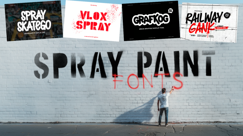
As designers, we’re constantly searching for fonts that can capture that raw, urban energy that only street art delivers. And in , spray paint fonts a...
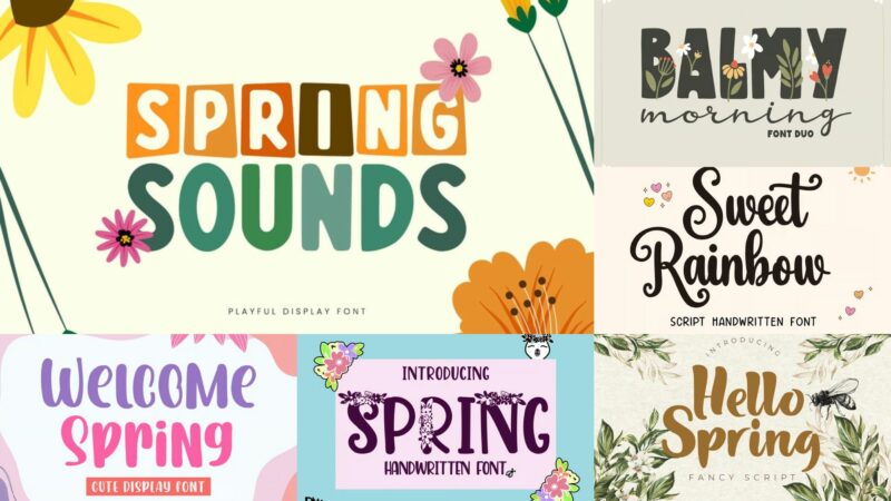
When it comes to spring, there’s something special about finding fonts that embody that sense of renewal, growth, and blossoming creativity that makes...
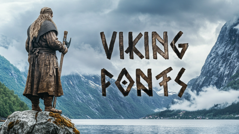
As a designer who’s worked on numerous Nordic-inspired projects, I’ve developed a deep appreciation for Viking fonts. There’s something undeniably pow...
You may think achieving a near-universal appeal sounds like an exercise in futility. However, it is challenging but not impossible to design graphics ...
There’s something undeniably great about pixel fonts. Whether they’re transporting us back to the early days of computing or adding an intentionally d...
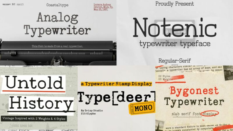
Ah…those slightly uneven characters, the mechanical imperfections, and the monospaced rhythm that instantly transports us to a different era. Of cours...
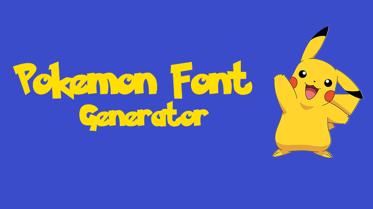
Transform your text into a Pokémon-style adventure with our free Pokémon font generator! Perfect for creating fan content, gaming materials, and catch...
I love talking to logo designers and learning what made them choose specific elements to include in their projects. They almost always mention the imp...
Whether you’re designing for a research institution, creating educational materials, or developing a tech startup’s brand identity, choosing the right...
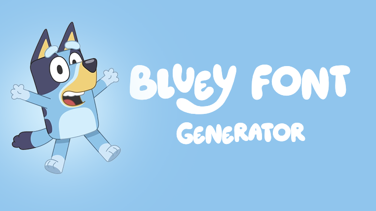
Transform your text into playful Bluey-style fun with our free Bluey font generator! Perfect for creating lively designs for family projects, parties,...
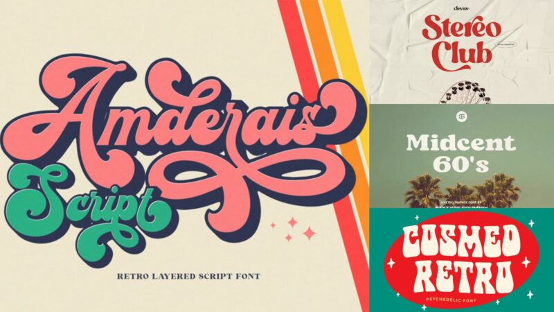
The swinging sixties brought us more than just incredible music and revolutionary fashion – it gave us some of the most iconic typography that continu...
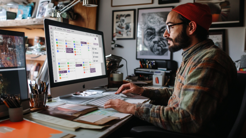
As a graphic designer juggling multiple clients and projects, staying organized isn’t just nice to have—it’s essential for survival. I learned this le...
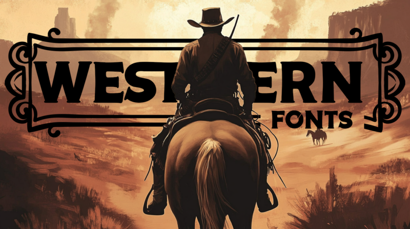
There’s something uniquely captivating about Western fonts. These aren’t just typefaces – they’re visual storytellers that transport us straight to th...
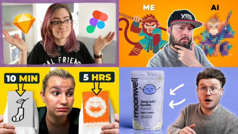
Let’s talk about graphic design for a minute. As someone who’s constantly looking to level up my design skills, I find myself regularly turning to You...
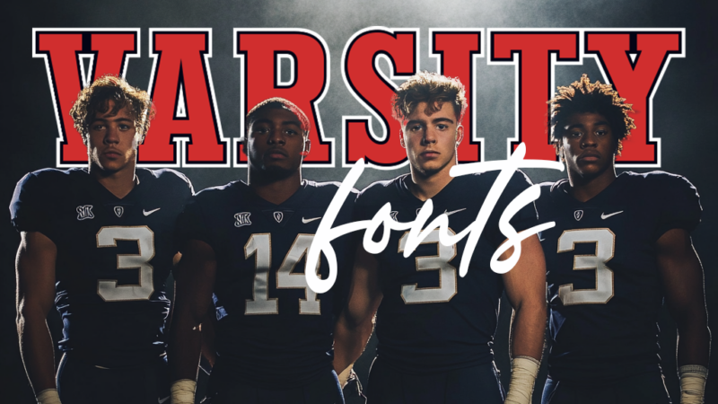
Varsity fonts are the MVPs of typography when it comes to capturing that classic collegiate and athletic spirit. These bold, distinctive letterforms h...
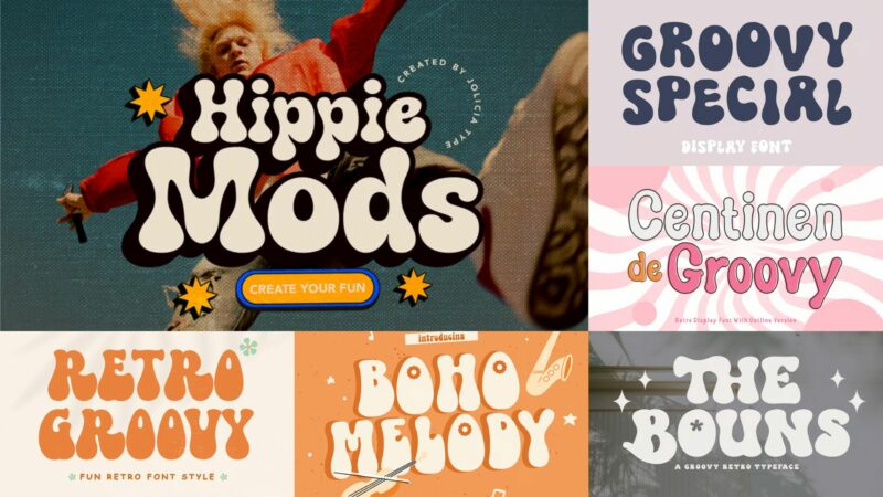
As a designer who’s spent countless hours exploring typography, I can tell you there’s something magical about groovy fonts. These funky letterforms t...
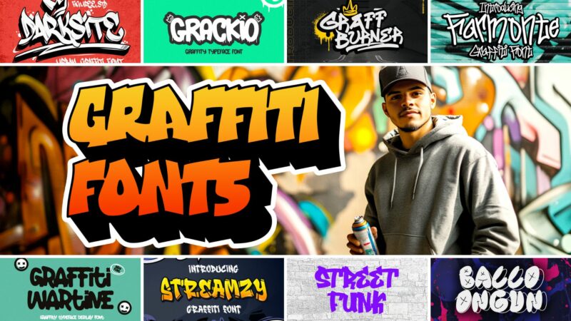
You can’t help but get excited about the raw energy and urban authenticity that graffiti fonts bring to modern design. Whether you’re creating edgy br...

The importance of a well-defined project brief cannot be overstated. A clear project brief is the foundation for success, bridging the gap between inn...
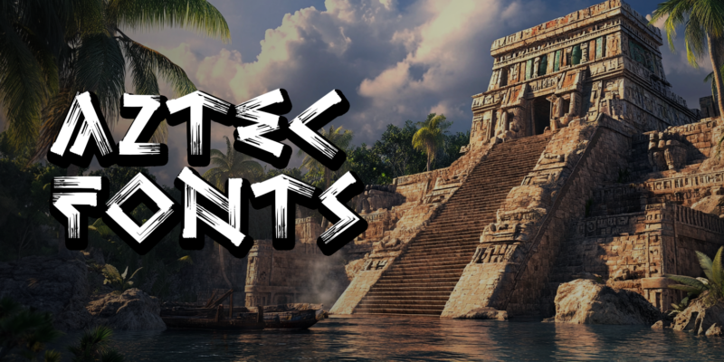
I’m fascinated by the intricate artistry of Aztec design. While creating this guide to Aztec-inspired fonts, I’ve made every effort to approach the su...
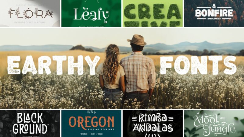
As designers, we’re constantly searching for fonts that can bring an authentic, organic feel to our projects. In , earthy fonts are seeing a huge resu...
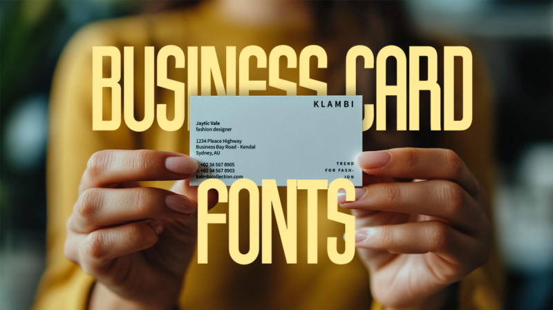
Selecting fonts for your business card might seem like a small detail, but it’s often the difference between a card that gets remembered and one that ...
A design portfolio may be a collection of your work, but it also shares your story. It is how you show potential clients and employers who you are as ...
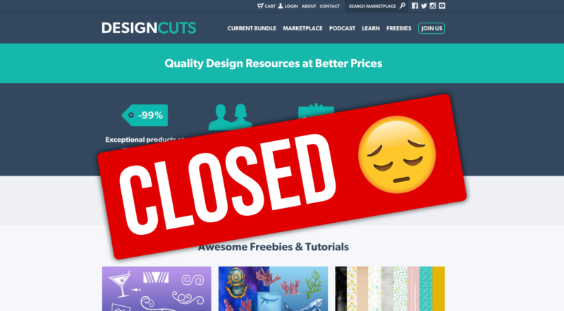
In a shocking move that has impacted the digital creative community, Design Cuts, a prominent marketplace for digital assets, ceased operations on Jan...
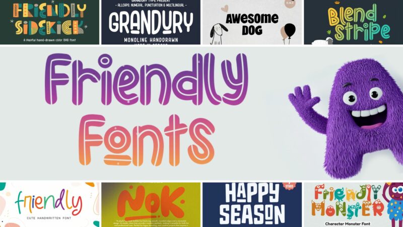
The right font can make the difference between a design that feels cold and distant versus one that instantly makes people feel welcome and at ease. F...
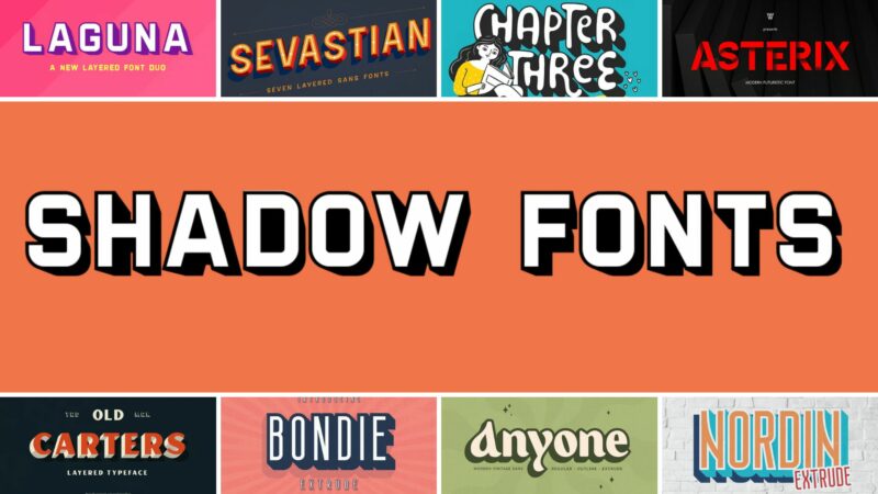
And when it comes to creating visual impact, shadow fonts are an absolute game-changer. Whether you’re working on attention-grabbing headers, dynamic ...
![[FREE] White App Icon Collection – Minimalist Icons for iOS & Android](https://designworklife.com/wp-content/uploads/2025/01/white-icon-mockup-med-800x450.png)
Transform your device with our carefully crafted collection of pure white icons. This free pack features 100 custom app icons that bring a clean, mini...
The world is full of geometric objects of every shape and color. When you’re used to interacting with squares, circles, hexagons and rhombuses, design...
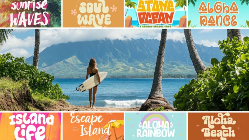
Finding the perfect Hawaiian font can transform an ordinary design into something that truly captures the aloha spirit. Whether you’re creating resort...

Design is more than just aesthetics—it’s about solving problems and creating impactful visuals. But the process can sometimes feel chaotic, especially...
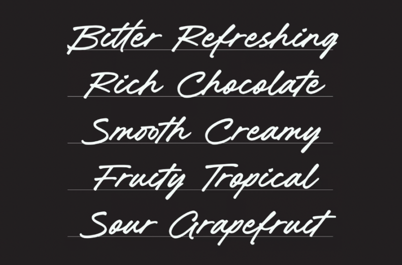
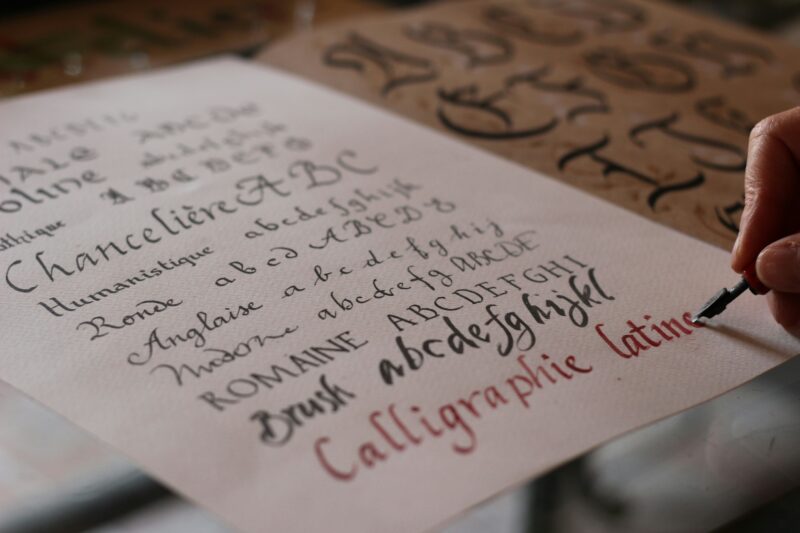
Cursive. The word might conjure up images of dusty calligraphy sets, your grandmother’s elegant handwriting, or maybe even a dreaded elementary school...
![[FREE] Wicked-Inspired App Icons to Help You ‘Defy Gravity’](https://designworklife.com/wp-content/uploads/2025/01/wicked-icon-mockup-thumbnail-med-800x450.png)
Transform your device with our spellbinding collection of icons inspired by the blockbuster movie Wicked. This free pack features 100 custom app icons...
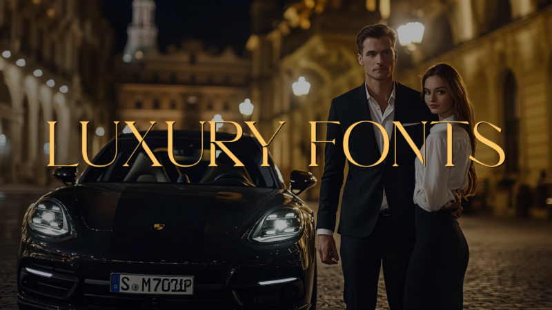
When you’re tasked with designing for luxury brands, choosing the right font can make the difference between a design that whispers “premium” and one ...
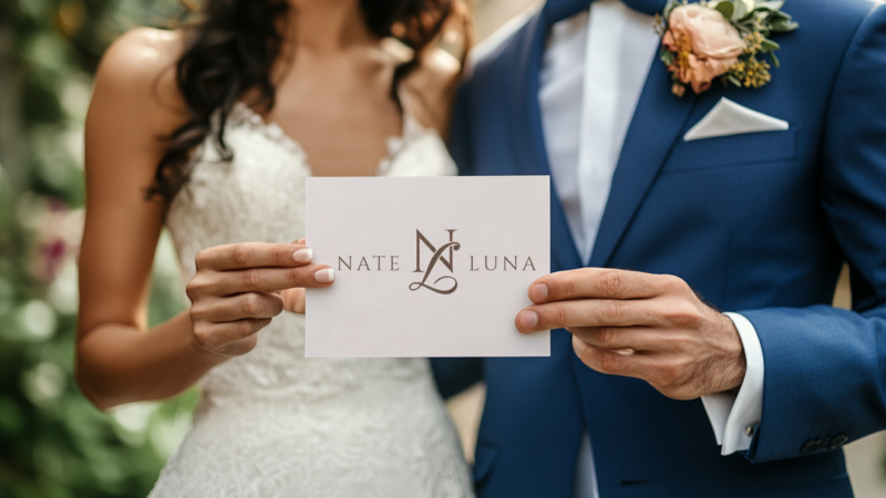
When it comes to planning your perfect wedding, every detail matters. And in today’s Instagram-ready world, having a stunning wedding logo isn’t just ...
I recently discovered a hidden gem on Etsy – AppIconStudio, a talented creator from Germany who has designed over 300 stunning app icon collections. R...
Tired of your usual favorites of the font variety? If your preferred typefaces have grown old and boring on you, you’ve opened the right blog post! He...
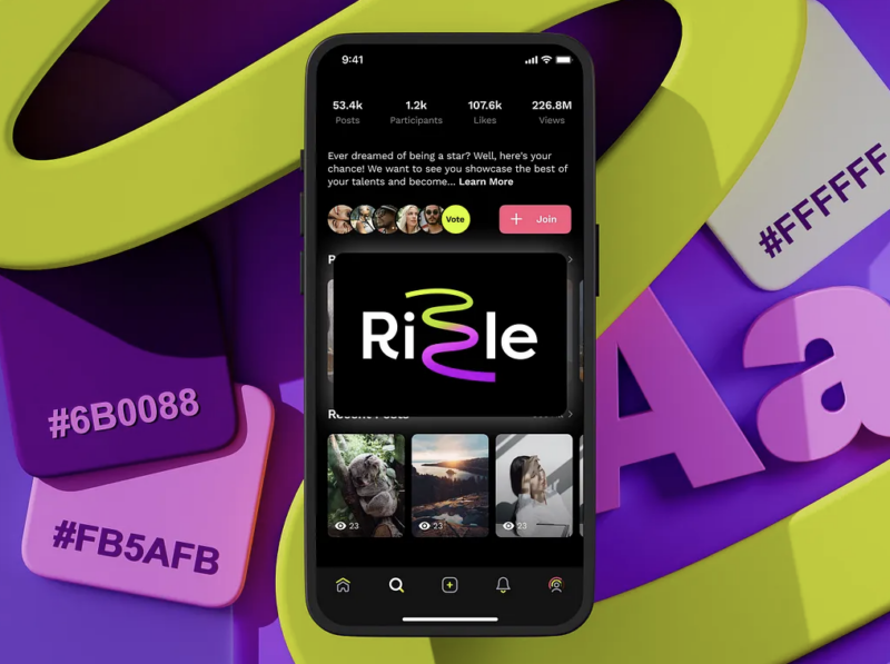
Instagram has become a creative playground where visuals dominate the conversation. For designers, photographers, influencers, and entrepreneurs, stan...
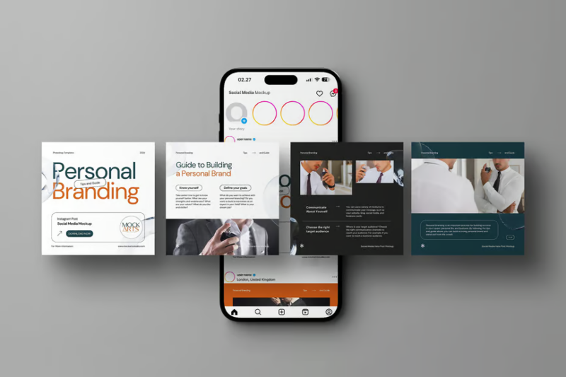
The right Instagram mockup can transform a simple design into a compelling preview of the final product. Whether you’re pitching to clients, showcasin...
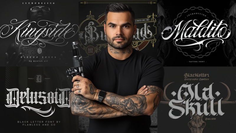
A font can make any lettering a work of art, even if the tattoo idea is pretty simple. Although many classics are used in both old and contemporary st...

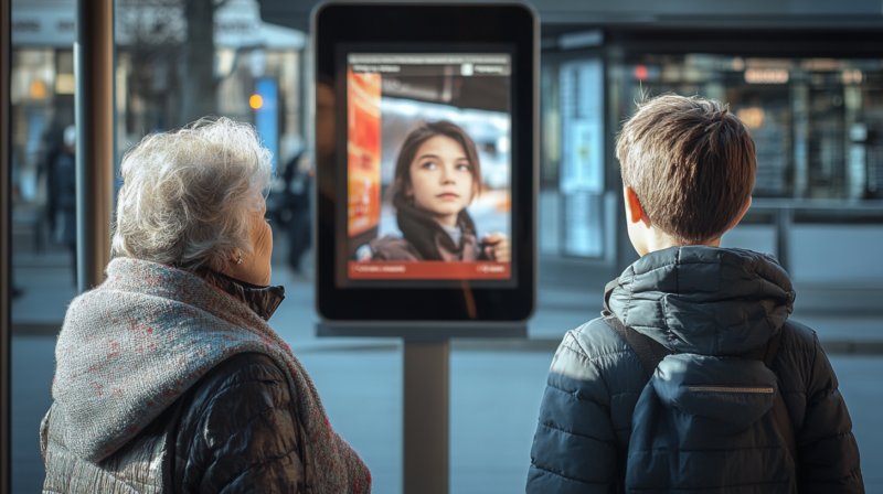
In graphic design, it is common for designers to focus on creating visually stunning content. Yet, how often do they stop to ask whether everyone can ...
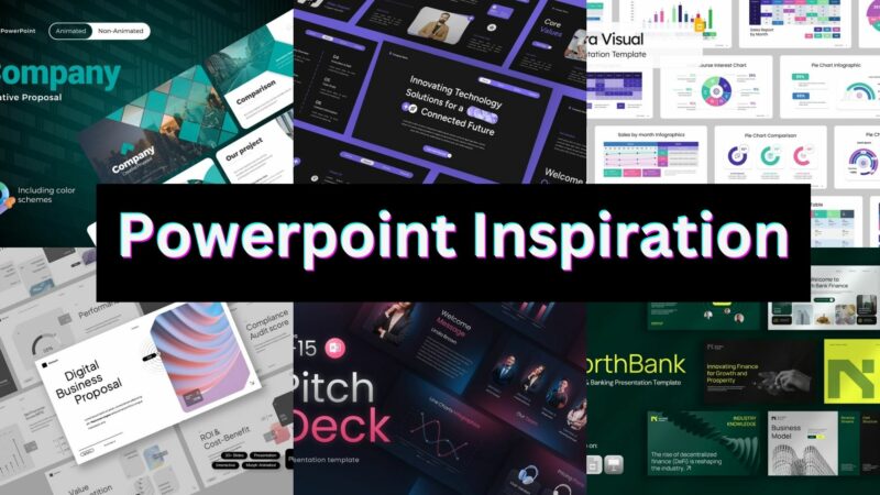
As a designer who’s seen countless presentations, I know the difference between slides that make audiences yawn and ones that make them lean forward i...
![[FREE] Pink App Icons for iPhone & Android](https://designworklife.com/wp-content/uploads/2025/01/pink-phone-icon-mockup-thumbnail-full-final-800x450.png)
Transform your iPhone with our enchanting collection of pink iOS icons. Download our free iPhone icon pack featuring 100 beautiful rose-tinted app ico...
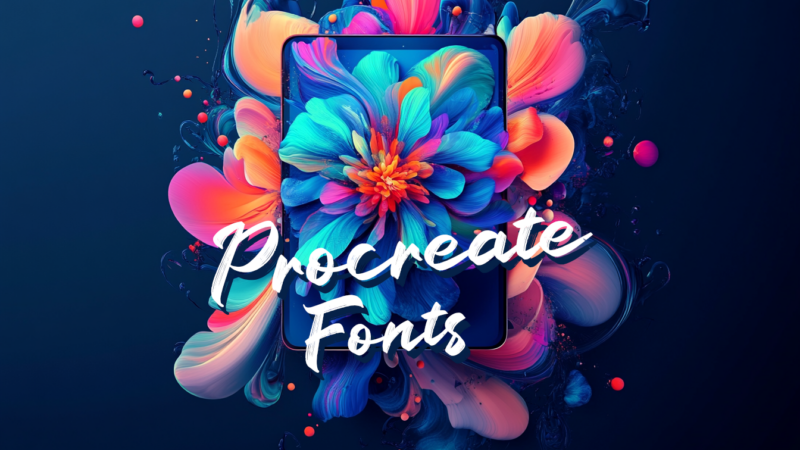
As a digital artist choosing the right font can make or break your digital artwork. Whether you’re designing social media graphics, creating custom le...
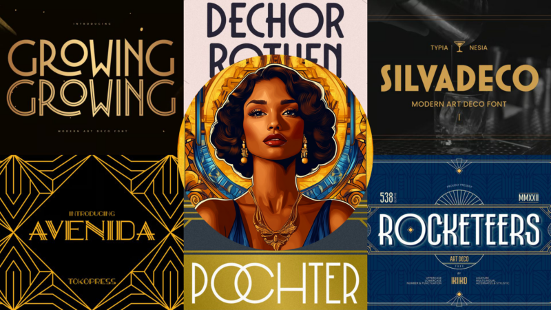
Art Deco fonts just seem to have their own indescribable charm, don’t they? There’s something magical about how these fonts can instantly transport a ...
![[FREE] Minimalist Black & White App Icons (iOS + Android)](https://designworklife.com/wp-content/uploads/2025/01/minimalist-black-ios-icon-mockup-thumbnail-med-1-800x450.png)
Transform your iPhone or Android phone with our stunning collection of minimalist black and white icons. Download our free icon pack featuring 100 bea...
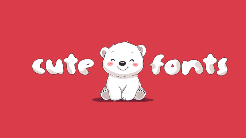
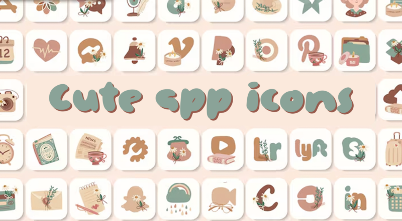
As a designer who’s worked on countless playful projects over the years, I’ve learned that finding the perfect cute font can transform an ordinary des...
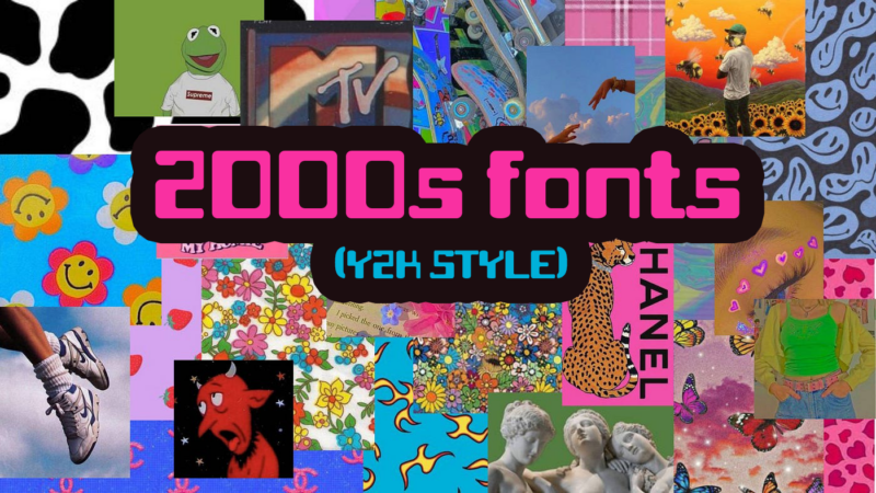
If you’ve noticed the resurgence of Y2K aesthetics lately, you’re not alone. As a designer who lived through (and designed in) the early 2000s, I’m fa...