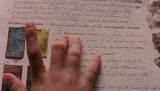
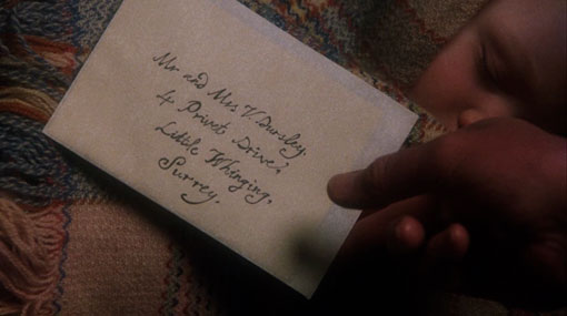
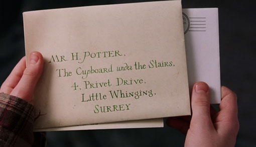
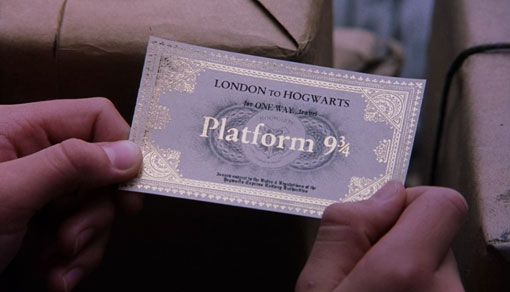
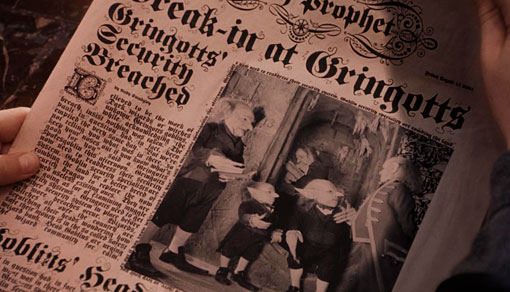
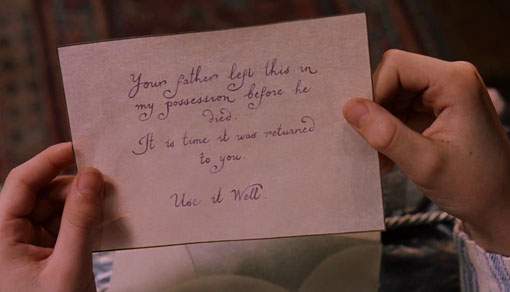
For the past however many years since the Harry Potter craze began, I’ve managed to avoid getting hooked. I’ll probably never read the books, but with the newest movie just released, I was finally convinced to start watching the series from the beginning. So over the weekend I began with the first one, Harry Potter and the Sorcerer’s Stone. And while the movie was definitely entertaining, I was completely distracted by the gorgeous typography used throughout. The meticulous attention to detail used to create this imaginary world, right down to the last letter, was extremely impressive. So I took it upon myself to take a few screenshots of the examples I liked most. Since I haven’t seen even a glimpse of the rest, I’m sure there will be more to come. Can’t wait.
Edit: There are tons of people credited on the art of the film, but I see two people actually listed as “lettering artists”, Bob Walker and Julian Walker.

Get 300+ Fonts for FREE
Enter your email to download our 100% free "Font Lover's Bundle". For commercial & personal use. No royalties. No fees. No attribution. 100% free to use anywhere.