How to Design a Table of Contents Like a Pro
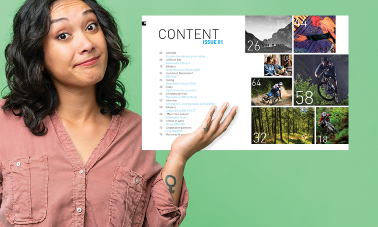
Ah, the table of contents. How can something that feels so boring on the surface also feel so intimidating as a designer? So today, I’d like to share some of my best advice for creating well-crafted and perfectly-designed tables of…